Introduction
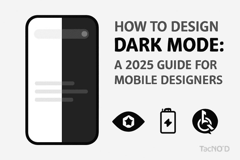
In 2025, dark mode isn’t just a trend—it’s an essential feature for mobile apps, demanded by users for aesthetics, comfort, and cutting-edge battery efficiency. Major platforms like iOS and Android have refined their dark themes, making nuanced color choices, accessibility, and seamless transitions a key priority for top-tier mobile designers. This comprehensive guide walks you through the best practices, design principles, and new tips for mastering dark mode UI in modern mobile app design.
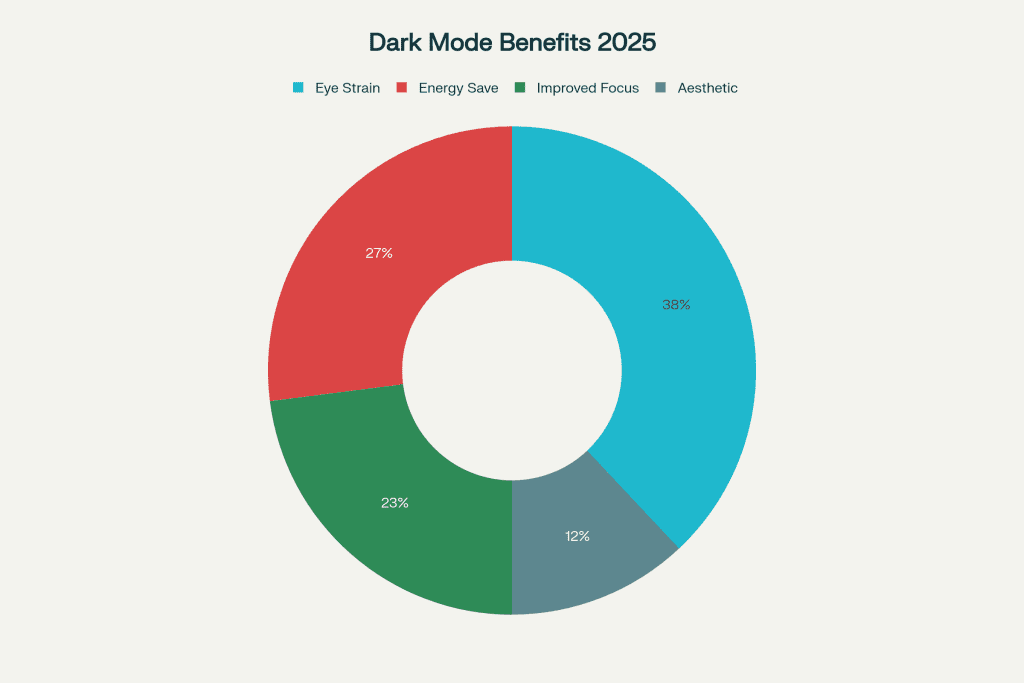
Why Dark Mode Matters in 2025
-
Reduces Eye Strain: Dark backgrounds with lighter text minimize eye pressure in low-light settings—users can browse longer, day or night.
-
Battery Efficiency: On OLED and AMOLED devices, dark themes save noticeable power by turning off pixels.
-
Modern Appeal: Dark UIs offer a sleek, premium look and let colors + highlights pop more than on light backgrounds.
-
Accessibility: With the right contrast, dark mode helps users with light sensitivity or visual impairments.
-
User Choice: Dark/light toggles let users personalize their experience, boosting engagement and satisfaction.
Core Principles for Effective Dark Mode Design
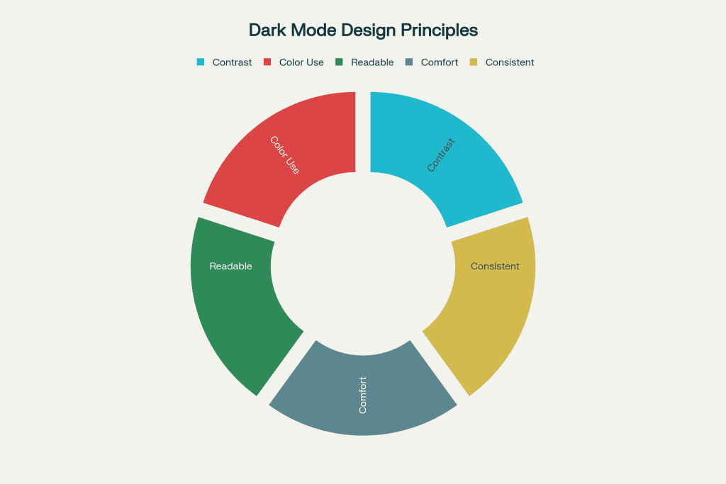
1. Avoid Pure Black—Use Deep Grays
-
Use dark gray backgrounds (#121212, #1b1b1b) instead of pure black (#000000) to reduce harshness and keep shadows natural.
-
Deep grays feel less stark, help UI elements blend, and improve readability.
2. Curate and Adapt Colors Carefully
-
Don’t just invert your color scheme. Re-calibrate each color for vibrancy against dark backgrounds.
-
Use desaturated, muted colors (like teal, blue, or purple) for UI elements to avoid excessive intensity.
3. Contrast Is Everything—But Balance It
-
Maintain high color contrast between text and backgrounds (ideally 15:1 per accessibility guidelines).
-
Prefer off-whites or light grays for text instead of pure white.
4. Design for Accessibility
-
Meet or exceed WCAG AA or AAA contrast standards for visually impaired users.
-
Enlarge text and interactive elements, and don’t rely solely on color to indicate state.
5. Minimize Glare and Visual Noise
-
Use negative space and minimalist layouts—it helps users scan content and reduces cognitive load.
-
Limit the use of highly saturated colors to alerts or primary action items.
6. Include Seamless Dark/Light Toggles
-
Give users a simple switch—either in-app or obey the OS setting—to swap between dark and light modes instantly.
7. Test Your Design in Real-World Conditions
-
Preview dark mode on different displays (OLED, LCD), in various ambient lighting scenarios, and with real users.
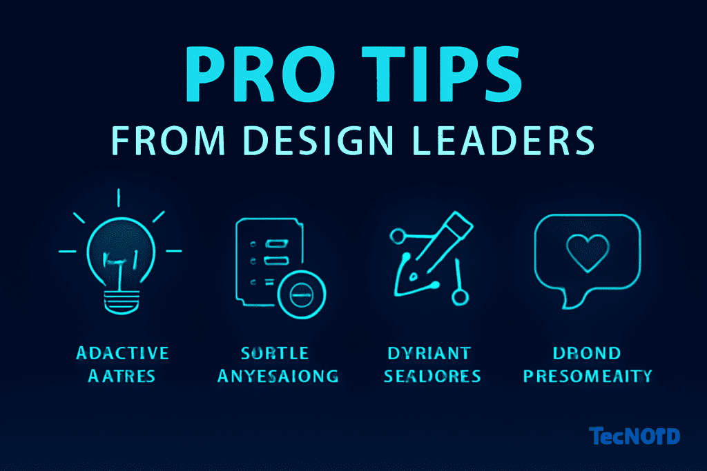
Pro Tips from Design Leaders
-
Use Adaptive Assets: Provide SVG or vector icons/symbols optimized for both light/dark backgrounds.
-
Incorporate Subtle Animations: Use micro-interactions or transitions to help users adjust visually between themes.
-
Dynamic Shadows and Elevation: Refine shadows and layers to enhance the perception of depth in dark mode.
-
Brand Personality in the Dark: Custom graphics or “Easter eggs” for dark mode can make your experience stand out.
Conclusion
Designing great dark mode in 2025 is about much more than flipping a color scheme. It’s a thoughtful, user-focused process blending visual comfort, brand personality, accessibility, and technical optimization. Mobile designers who get dark mode right deliver experiences users love—sleek, stylish, and future-proof.
FAQ
1. Is dark mode better for eye health?
It reduces eye strain in low-light settings and is preferred by users with light sensitivity. It’s best to let users switch modes based on their needs.
2. Should I just invert the colors from my app’s light mode?
No. Each color and element should be recalculated for best readability, accessibility, and emotion on dark backgrounds.
3. What’s the best background color for dark mode?
Avoid pure black; use dark grays (#121212 or #1b1b1b). These are easier to look at and keep contrast from being too harsh.
4. How can I test for good dark mode design?
Run accessibility audits, preview on different screens, compare in various lighting, and gather real user feedback.
5. Do I need a toggle or should my app match the system setting?
Offer both—a dedicated toggle for user control, and the ability to automatically match device/system-wide theme settings.


